Cyfercore/Real-time-incident-tracking-and-outcome-reporting
GitHub: Cyfercore/Real-time-incident-tracking-and-outcome-reporting
一套基于低代码工具链构建的实时紧急医疗事件追踪与结果报告系统,通过自动化数据管道和多页交互式 dashboard 为急救运营团队提供事件监控、绩效分析和患者结果追踪能力。
Stars: 0 | Forks: 0
# 实时事件追踪与结果报告
一个实时紧急事件分析系统,具备自动化数据 pipeline 和交互式 dashboard,用于监控响应性能、患者结果和运营效率。
本项目为 HealthResponse Ltd. 实现了实时紧急事件追踪和结果报告系统。它使用 Microsoft Forms 和 Power Automate 自动化数据收集,将结构化的事件日志存储在 Google Sheets 中,并通过 Looker Studio dashboard 可视化运营性能。
## ⚠️ 运营问题
HealthResponse Ltd. 需要一种可靠的方法来追踪紧急事件,从报告的那一刻起直到记录患者结果。现有的工作流程依赖于手动记录、延迟更新和互不连通的工具,这引发了一些运营问题:
- **事件数据是被手动捕获的**,通常跨越不同系统,导致延迟和不一致。
- **管理者缺乏实时可见性**来监控活跃事件、响应时间或团队绩效。
- **患者结果未被结构化追踪**,导致难以分析干预措施的有效性。
- **报告缓慢且被动**,需要在一天或一周结束时进行手动汇总。
- **在没有实时数据的情况下做出运营决策**,限制了在高峰需求期间高效分配资源的能力。
这些差距使得 HealthResponse 难以维持高响应标准、监控服务质量,并识别能够改善患者护理的趋势。
## 📦 交付成果
该项目产出了一个完整可运行、端到端的事件追踪和报告系统,旨在支持 HealthResponse Ltd. 的实时决策。关键交付物包括:
### 1. 实时事件采集表单 (Microsoft Forms)
一种结构化的数字表单,供响应人员在接触点一致且准确地记录紧急事件。
### 2. 自动化数据 Pipeline (Power Automate)
一种工作流,可将提交的事件数据直接传输到集中的 Google Sheets 数据库中,消除了手动输入并确保实时更新。
### 3. 集中事件数据库 (Google Sheets)
一个实时的、结构化的数据集,用于存储所有事件记录、结果、时间戳和运营细节,以用于报告和分析。
### 4. 多页 Looker Studio Dashboard
一组交互式 dashboard,提供对以下方面的实时可见性:
- 事件量和趋势
- 响应性能
- 患者结果
- 区域活动
- 干预有效性
- SLA 合规性
### 5. KPI 监控框架
定义并实施了关键的运营指标,如响应时间、升级率、优先级分布和结果类别,以支持绩效追踪。
### 6. 运营报告层
一个统一的报告环境,使管理者能够监控实时事件,识别瓶颈,并在高峰需求期间做出明智的决策。
## 🏗️ 系统架构
该系统构建为一个轻量级、实时的运营 pipeline,将数据收集、自动化、存储和报告连接到一个单一的工作流中。该架构确保事件数据无缝地从一线响应人员流向管理 dashboard,无需人工干预。
Microsoft Forms
↓
Power Automate (自动化工作流)
↓
Google Sheets (集中式实时数据库)
↓
Looker Studio (交互式 Dashboard 与报告)
### 🔍 组件细分
**1. Microsoft Forms – 事件采集**
一线响应人员通过结构化的数字表单提交事件详情,确保数据捕获的一致性和准确性。
**2. Power Automate – 数据 Pipeline 自动化**
自动化工作流处理每个表单提交,并将数据实时直接写入 Google Sheets。
**3. Google Sheets – 运营数据存储**
作为所有事件记录、结果、时间戳和运营字段的集中式、始终最新的数据库。
**4. Looker Studio – 实时 Dashboard**
Dashboard 直接连接到实时数据集,使管理者能够立即了解事件活动、响应性能、患者结果和区域趋势。
## 📺 Dashboard
报告层构建在 Looker Studio 中,并组织成多个页面以支持不同的运营视图。
### 1. 执行摘要 – Dashboard 概览
此 **执行摘要** dashboard 提供了紧急事件活动和运营绩效的实时快照。它突出了总体工作量、响应效率、案例严重性和团队绩效,以便决策者能够一目了然地了解系统压力,同时也展示了总体事件活动、响应指标和升级的高层次视图。
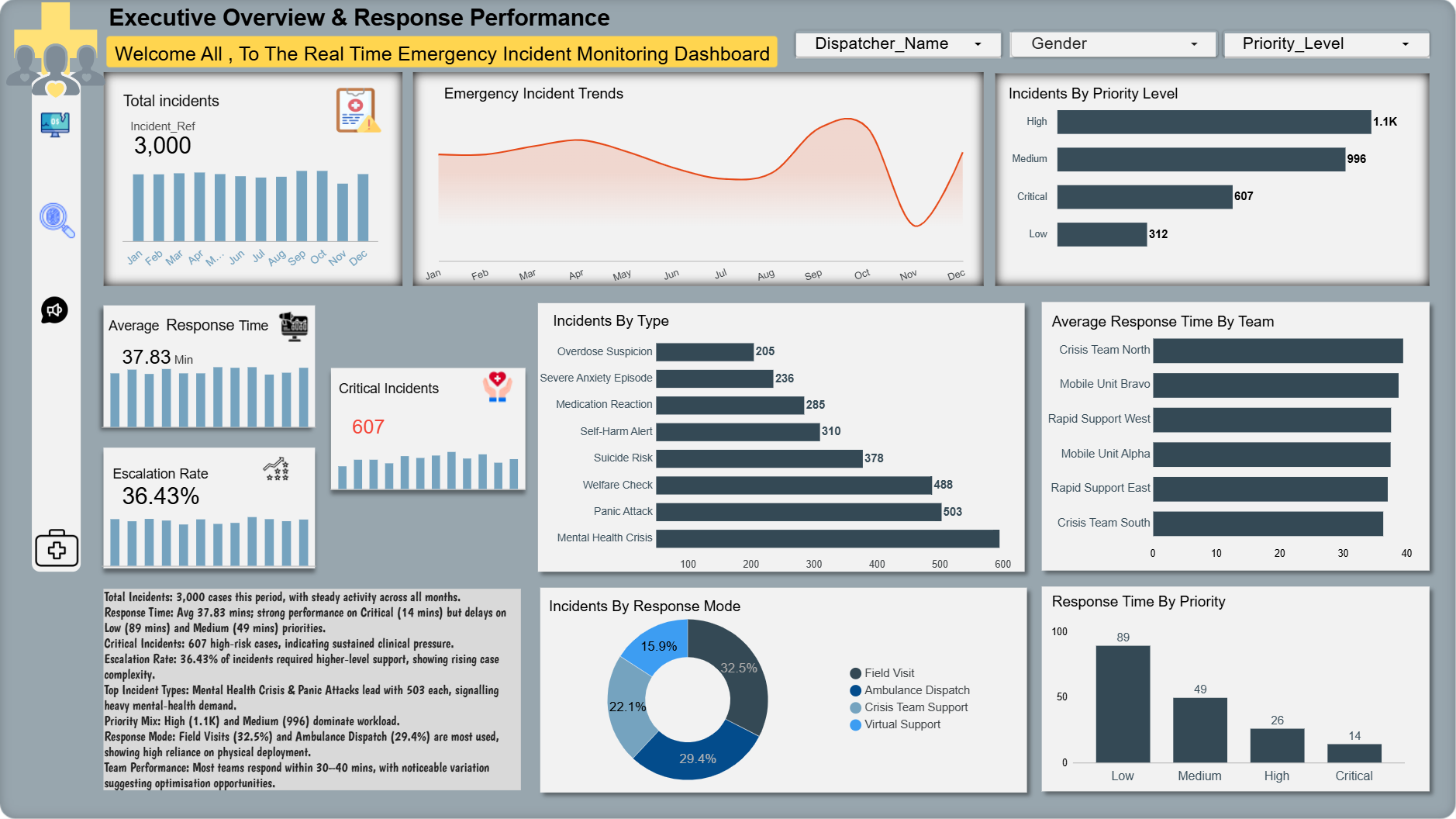 ### 关键洞察
- **事件总数:3,000** — 各月份活动平稳,显示出一致的服务需求。
- **平均响应时间:37.83 分钟** — **危急** 病例表现强劲(14 分钟),但在**低**(89 分钟)和**中**(49 分钟)优先级上存在延迟。
- **危急事件:607** — 持续的高风险工作量表明存在临床压力。
- **升级率:36.43%** — 超过三分之一的案例需要更高级别的支持,表明案例复杂性正在上升。
- **事件类型** — 心理健康危机和恐慌发作是最常见的类别,分别达到 503 例。
- **优先级组合** — 高 (1.1K) 和中 (996) 优先级占据了主要工作量。
- **响应模式** — 现场访问 (32.5%) 和救护车调度 (29.4%) 使用最多,显示出对物理部署的依赖。
- **团队绩效** — 大多数团队在 30-40 分钟内响应,存在明显的差异,凸显了优化的机会。
### 此 Dashboard 显示的内容
- **[事件趋势](ca://s?q=Explain_incident_trends_chart)** — 随时间变化的工作量模式
- **[优先级分布](ca://s?q=Explain_priority_distribution)** — 严重程度组合和风险级别
- **[事件类型](ca://s?q=Explain_incident_types_breakdown)** — 推动需求的主导类别
- **[各团队响应时间](ca://s?q=Explain_team_response_time_chart)** — 运营瓶颈
- **[响应模式](ca://s?q=Explain_response_modes)** — 资源分配和部署组合
- **[绩效摘要](ca://s?q=Summarise_dashboard_performance)** — 适合领导层的洞察
### 2. 患者结果
关注干预措施、患者状况和结果类别,以了解响应的有效性并支持护理质量审查。
### 患者结果 — 关键洞察
- **事件总数:** **3,000** — 窗口期内需求稳定;没有单日激增。
- **平均响应时间:** **37.83 分钟** — 总体可接受,但因优先级而异(危急比中/低快得多)。
- **SLA 合规性:** **69.43%** — 低于目标;调查中和低优先级的延迟。
- **危急事件:** **607** — 持续的高风险病例量,需要临床监督。
- **主要干预措施:** **现场评估**、**降级支持**、**情感咨询** — 使用率最高,也是现场解决结果的主要驱动力。
- **结果组合:** 大量 **现场解决** 和 **需要随访**;不可忽视的 **转诊/入院** 影响了容量规划。
- **人口统计:** 最大群体为 **31-45** 岁;年龄和性别划分有助于进行有针对性的外展。
- **可操作提示:** 标记 SLA 合规性 < **80%**(7 天滚动);对中优先级积压进行分流;当危急情况每日 > **10%** 时,重新分配现场评估资源。
### 此 Dashboard 显示的内容
- **绩效 KPI:** 事件总数、平均响应时间、升级率、危急事件,并带有简短的趋势指标。
- **结果分布:** 现场解决、需要随访、转诊至医院、入院观察、升级至危机团队、未联系上的计数和比例。
- **SLA 合规性:** 显示满足响应时间目标的事件百分比的仪表盘,以及明确的 SLA 目标参考。
- **干预措施的使用和有效性:** 干预类型(现场评估、降级、咨询、用药建议、保障转诊)及其结果相关性的条形图和矩阵视图。
- **患者特征和严重程度:** 年龄和性别分布;患者状况计数(痛苦、危急、稳定、无反应)。
- **深入分析和过滤器:** 按优先级、区域、团队和时间窗口过滤,用于运营跟进。
- **运营说明:** 数据窗口:过去 30 天;每小时更新。最后更新:**YYYY-MM-DD HH:MM**。负责人:负责 SLA 违规的值班运营人员;每周审查干预有效性。
**扩展描述**
数据窗口:过去 30 天;每小时更新。
关键指标:事件总数、平均响应时间、升级率、危急事件。
SLA 目标:危急 ≤ 15 分钟;高 ≤ 30 分钟;中 ≤ 60 分钟;低 ≤ 120 分钟。
当前 SLA 合规性:69.43%(调查中和低优先级的延迟)。
首要行动:值班运营人员处理 SLA 违规;对中优先级积压进行分流;每周审查干预有效性。
最后更新:2026-05-25 10:22 BST
### 3. 区域概览与患者表现
**描述**
此 dashboard 提供了跨区域的事件分布、到达时患者状态、按地点类型划分的结果以及绩效模式的综合视图,有助于识别热点、弱势群体和运营改进领域。
### 关键洞察
- **事件量:** 总计 3,000 起事件,主要活动集中在伦敦、伯明翰、曼彻斯特、利兹和纽卡斯尔等大城市。
- **地点类型模式:** 大多数事件发生在**家庭 (1,677)** 中,其次是**公共区域 (452)** 和**护理院 (360)**。
- **结果分布:** **现场解决**、**需要随访**和**转诊至医院**的比例较高,而**升级**、**入院**和**未联系上**的比例较小。
- **到达时患者状态:** **痛苦 (1,340)** 和 **危急 (825)** 病例数量多,表明前线压力巨大。
- **弱势群体:** 护理院的弱势率最高(**55%**),需要有针对性的保障和支持。
- **按地点划分的响应时间:** 响应时间因地点类型略有不同,从 **35.68 到 39.9 分钟**不等,其中护理院的延迟最长。
- **运营热点:** 应优先为事件密度高且弱势群体比例高的区域分配资源。
### 此 Dashboard 显示的内容
- **英国区域事件地图**,标有大城市和热点。
- **事件总数**,带有月度趋势条(1 月–12 月)。
- **按地点类型划分的事件**(家庭、公共区域、护理院、医院、工作场所)。
- **按地点类型划分的结果**,包括需要随访、现场解决、转诊至医院、升级、入院和未联系上。
- **到达时患者状态**(痛苦、危急、稳定、无反应)。
- **按地点类型进行的弱势人员分析**,包括计数和百分比。
- **按地点类型划分的响应时间**,显示每个类别的平均分钟数。
- **过滤器**,用于区域、调度员姓名、性别和优先级。
**最后更新:** 2026-05-25 17:06
**摘要**
交付了一个生产级的实时事件追踪和结果报告系统,将分散的手动日志转变为自动化分析 pipeline 和运营 dashboard。这项工作使运营和临床团队能够更快地做出基于证据的决策,并在可见性和优先级排序方面取得了显著改善。
### 关键学习
- **根据风险和脆弱性确定优先级** — 护理院和高密度城市地区始终驱动着最大的运营风险,应首先进行有针对性的干预。
- **干预驱动结果** — 现场评估和降级显示出与现场解决结果和减少复联的最强关联。
- **领先指标很重要** — 复联和随访积压是转诊和入院增加的可靠早期预警。
- **数据质量是信任的基础** — 标准化的采集和自动化 pipeline 减少了人为错误,并切实提高了前线决策所依赖的 dashboard 的可靠性。
- **为行动而设计** — 将简洁的洞察与明确归属的行动(谁、何时、阈值)相结合的 dashboard,增加了运营跟进落实的可能性。
### 展示的技能
- **数据集成与 ETL** — 构建了自动化 pipeline(Forms → Power Automate → Google Sheets),以集中化事件、调度和结果数据。
- **数据建模与验证** — 设计了 schema,实施了交叉检查,并验证了计数、时间戳和弱势群体标记。
- **Dashboard 设计与可视化** — 为运营和执行受众创建了多页的 Looker Studio dashboard(地图、漏斗、仪表盘、队列表格)。
- **运营分析** — 定义了 KPI 和领先指标(响应时间、升级率、复联),并将它们与可操作的阈值联系起来。
- **队列分析与临床评估** — 按年龄、地点和事件类型进行细分,以识别高风险队列并评估干预有效性。
- **利益相关者参与和沟通** — 将分析转化为简洁的简报、playbook 和为运营和临床主管制定的可执行任务。
- **质量保证与迭代** — 实施了验证测试和每周反馈循环,以完善视觉效果、阈值和注释。
### 展示的影响(示例)
- **资源重新分配:** 利用区域和弱势信号,证明在高峰时段将移动单元转移到高需求地区的合理性。
- **临床优先级排序:** 在观察到现场评估与现场解决结果之间的强烈关联后,建议开展有针对性的现场评估。
- **流程改进:** 引入了对随访积压项目的每日分流,减少了试点地区目标队列中的复联率。
- **更快的决策制定:** 用每小时更新的 dashboard 取代了每日结束时的手动报告,实现了实时的运营调整。
### 扩大影响的后续步骤
- **正式确立 playbook**,将 dashboard 信号与运营行动和指定的负责人关联起来。
- **追踪成功指标**(复联率、现场解决率、首次随访时间)以衡量干预措施。
- **为领先指标(随访积压、复联增加)自动化警报**,以触发预定义的升级工作流。
- **扩展队列分析**,以纳入社会决定因素和重复来电者案例管理。
**角色与贡献**
领导了端到端的交付:采集设计、pipeline 自动化、数据建模、dashboard 构建、验证和运营交接。
### 使用的技术
| **工具 / 技术** | **用途** | **备注** |
|---|---|---|
| **Microsoft Forms** | 事件采集表单 | 结构化的前线数据捕获 |
| **Power Automate** | ETL / pipeline 自动化 | 从 Forms 到 Sheets 的实时传输 |
| **Google Sheets** | 集中式运营数据存储 | schema、公式和轻量级建模 |
| **Looker Studio** | 交互式 dashboard 与报告 | 多页 dashboard、地图、漏斗、仪表盘 |
| **SQL / Google Sheets 公式** | 数据建模与聚合 | 衍生指标、队列查询、验证检查 |
| **脚本 (Apps Script / Python)** | 验证与自动化任务 | 数据质量检查和简单的自动化 |
| **通知 (电子邮件 / Slack)** | 警报和运营通知 | 针对负责人和阈值的自动警报 |
| **利益相关者工具** | 交接与协作 | playbook、简报和每周审查说明 |
### 联系方式
**主要联系人**
**姓名:** Collins
**电子邮件:** **Collins@cyfercore.com**
**LinkedIn:** **[https://www.linkedin.com/in/collins](https://www.linkedin.com/public-profile/settings/?lipi=urn%3Ali%3Apage%3Ad_flagship3_profile_self_edit_contact_info%3BJYYNbJ4lQQyixFn8AGLUBA%3D%3D)**
**位置:** **英国,伯明翰**
### 关键洞察
- **事件总数:3,000** — 各月份活动平稳,显示出一致的服务需求。
- **平均响应时间:37.83 分钟** — **危急** 病例表现强劲(14 分钟),但在**低**(89 分钟)和**中**(49 分钟)优先级上存在延迟。
- **危急事件:607** — 持续的高风险工作量表明存在临床压力。
- **升级率:36.43%** — 超过三分之一的案例需要更高级别的支持,表明案例复杂性正在上升。
- **事件类型** — 心理健康危机和恐慌发作是最常见的类别,分别达到 503 例。
- **优先级组合** — 高 (1.1K) 和中 (996) 优先级占据了主要工作量。
- **响应模式** — 现场访问 (32.5%) 和救护车调度 (29.4%) 使用最多,显示出对物理部署的依赖。
- **团队绩效** — 大多数团队在 30-40 分钟内响应,存在明显的差异,凸显了优化的机会。
### 此 Dashboard 显示的内容
- **[事件趋势](ca://s?q=Explain_incident_trends_chart)** — 随时间变化的工作量模式
- **[优先级分布](ca://s?q=Explain_priority_distribution)** — 严重程度组合和风险级别
- **[事件类型](ca://s?q=Explain_incident_types_breakdown)** — 推动需求的主导类别
- **[各团队响应时间](ca://s?q=Explain_team_response_time_chart)** — 运营瓶颈
- **[响应模式](ca://s?q=Explain_response_modes)** — 资源分配和部署组合
- **[绩效摘要](ca://s?q=Summarise_dashboard_performance)** — 适合领导层的洞察
### 2. 患者结果
关注干预措施、患者状况和结果类别,以了解响应的有效性并支持护理质量审查。
### 患者结果 — 关键洞察
- **事件总数:** **3,000** — 窗口期内需求稳定;没有单日激增。
- **平均响应时间:** **37.83 分钟** — 总体可接受,但因优先级而异(危急比中/低快得多)。
- **SLA 合规性:** **69.43%** — 低于目标;调查中和低优先级的延迟。
- **危急事件:** **607** — 持续的高风险病例量,需要临床监督。
- **主要干预措施:** **现场评估**、**降级支持**、**情感咨询** — 使用率最高,也是现场解决结果的主要驱动力。
- **结果组合:** 大量 **现场解决** 和 **需要随访**;不可忽视的 **转诊/入院** 影响了容量规划。
- **人口统计:** 最大群体为 **31-45** 岁;年龄和性别划分有助于进行有针对性的外展。
- **可操作提示:** 标记 SLA 合规性 < **80%**(7 天滚动);对中优先级积压进行分流;当危急情况每日 > **10%** 时,重新分配现场评估资源。
### 此 Dashboard 显示的内容
- **绩效 KPI:** 事件总数、平均响应时间、升级率、危急事件,并带有简短的趋势指标。
- **结果分布:** 现场解决、需要随访、转诊至医院、入院观察、升级至危机团队、未联系上的计数和比例。
- **SLA 合规性:** 显示满足响应时间目标的事件百分比的仪表盘,以及明确的 SLA 目标参考。
- **干预措施的使用和有效性:** 干预类型(现场评估、降级、咨询、用药建议、保障转诊)及其结果相关性的条形图和矩阵视图。
- **患者特征和严重程度:** 年龄和性别分布;患者状况计数(痛苦、危急、稳定、无反应)。
- **深入分析和过滤器:** 按优先级、区域、团队和时间窗口过滤,用于运营跟进。
- **运营说明:** 数据窗口:过去 30 天;每小时更新。最后更新:**YYYY-MM-DD HH:MM**。负责人:负责 SLA 违规的值班运营人员;每周审查干预有效性。
**扩展描述**
数据窗口:过去 30 天;每小时更新。
关键指标:事件总数、平均响应时间、升级率、危急事件。
SLA 目标:危急 ≤ 15 分钟;高 ≤ 30 分钟;中 ≤ 60 分钟;低 ≤ 120 分钟。
当前 SLA 合规性:69.43%(调查中和低优先级的延迟)。
首要行动:值班运营人员处理 SLA 违规;对中优先级积压进行分流;每周审查干预有效性。
最后更新:2026-05-25 10:22 BST
### 3. 区域概览与患者表现
**描述**
此 dashboard 提供了跨区域的事件分布、到达时患者状态、按地点类型划分的结果以及绩效模式的综合视图,有助于识别热点、弱势群体和运营改进领域。
### 关键洞察
- **事件量:** 总计 3,000 起事件,主要活动集中在伦敦、伯明翰、曼彻斯特、利兹和纽卡斯尔等大城市。
- **地点类型模式:** 大多数事件发生在**家庭 (1,677)** 中,其次是**公共区域 (452)** 和**护理院 (360)**。
- **结果分布:** **现场解决**、**需要随访**和**转诊至医院**的比例较高,而**升级**、**入院**和**未联系上**的比例较小。
- **到达时患者状态:** **痛苦 (1,340)** 和 **危急 (825)** 病例数量多,表明前线压力巨大。
- **弱势群体:** 护理院的弱势率最高(**55%**),需要有针对性的保障和支持。
- **按地点划分的响应时间:** 响应时间因地点类型略有不同,从 **35.68 到 39.9 分钟**不等,其中护理院的延迟最长。
- **运营热点:** 应优先为事件密度高且弱势群体比例高的区域分配资源。
### 此 Dashboard 显示的内容
- **英国区域事件地图**,标有大城市和热点。
- **事件总数**,带有月度趋势条(1 月–12 月)。
- **按地点类型划分的事件**(家庭、公共区域、护理院、医院、工作场所)。
- **按地点类型划分的结果**,包括需要随访、现场解决、转诊至医院、升级、入院和未联系上。
- **到达时患者状态**(痛苦、危急、稳定、无反应)。
- **按地点类型进行的弱势人员分析**,包括计数和百分比。
- **按地点类型划分的响应时间**,显示每个类别的平均分钟数。
- **过滤器**,用于区域、调度员姓名、性别和优先级。
**最后更新:** 2026-05-25 17:06
**摘要**
交付了一个生产级的实时事件追踪和结果报告系统,将分散的手动日志转变为自动化分析 pipeline 和运营 dashboard。这项工作使运营和临床团队能够更快地做出基于证据的决策,并在可见性和优先级排序方面取得了显著改善。
### 关键学习
- **根据风险和脆弱性确定优先级** — 护理院和高密度城市地区始终驱动着最大的运营风险,应首先进行有针对性的干预。
- **干预驱动结果** — 现场评估和降级显示出与现场解决结果和减少复联的最强关联。
- **领先指标很重要** — 复联和随访积压是转诊和入院增加的可靠早期预警。
- **数据质量是信任的基础** — 标准化的采集和自动化 pipeline 减少了人为错误,并切实提高了前线决策所依赖的 dashboard 的可靠性。
- **为行动而设计** — 将简洁的洞察与明确归属的行动(谁、何时、阈值)相结合的 dashboard,增加了运营跟进落实的可能性。
### 展示的技能
- **数据集成与 ETL** — 构建了自动化 pipeline(Forms → Power Automate → Google Sheets),以集中化事件、调度和结果数据。
- **数据建模与验证** — 设计了 schema,实施了交叉检查,并验证了计数、时间戳和弱势群体标记。
- **Dashboard 设计与可视化** — 为运营和执行受众创建了多页的 Looker Studio dashboard(地图、漏斗、仪表盘、队列表格)。
- **运营分析** — 定义了 KPI 和领先指标(响应时间、升级率、复联),并将它们与可操作的阈值联系起来。
- **队列分析与临床评估** — 按年龄、地点和事件类型进行细分,以识别高风险队列并评估干预有效性。
- **利益相关者参与和沟通** — 将分析转化为简洁的简报、playbook 和为运营和临床主管制定的可执行任务。
- **质量保证与迭代** — 实施了验证测试和每周反馈循环,以完善视觉效果、阈值和注释。
### 展示的影响(示例)
- **资源重新分配:** 利用区域和弱势信号,证明在高峰时段将移动单元转移到高需求地区的合理性。
- **临床优先级排序:** 在观察到现场评估与现场解决结果之间的强烈关联后,建议开展有针对性的现场评估。
- **流程改进:** 引入了对随访积压项目的每日分流,减少了试点地区目标队列中的复联率。
- **更快的决策制定:** 用每小时更新的 dashboard 取代了每日结束时的手动报告,实现了实时的运营调整。
### 扩大影响的后续步骤
- **正式确立 playbook**,将 dashboard 信号与运营行动和指定的负责人关联起来。
- **追踪成功指标**(复联率、现场解决率、首次随访时间)以衡量干预措施。
- **为领先指标(随访积压、复联增加)自动化警报**,以触发预定义的升级工作流。
- **扩展队列分析**,以纳入社会决定因素和重复来电者案例管理。
**角色与贡献**
领导了端到端的交付:采集设计、pipeline 自动化、数据建模、dashboard 构建、验证和运营交接。
### 使用的技术
| **工具 / 技术** | **用途** | **备注** |
|---|---|---|
| **Microsoft Forms** | 事件采集表单 | 结构化的前线数据捕获 |
| **Power Automate** | ETL / pipeline 自动化 | 从 Forms 到 Sheets 的实时传输 |
| **Google Sheets** | 集中式运营数据存储 | schema、公式和轻量级建模 |
| **Looker Studio** | 交互式 dashboard 与报告 | 多页 dashboard、地图、漏斗、仪表盘 |
| **SQL / Google Sheets 公式** | 数据建模与聚合 | 衍生指标、队列查询、验证检查 |
| **脚本 (Apps Script / Python)** | 验证与自动化任务 | 数据质量检查和简单的自动化 |
| **通知 (电子邮件 / Slack)** | 警报和运营通知 | 针对负责人和阈值的自动警报 |
| **利益相关者工具** | 交接与协作 | playbook、简报和每周审查说明 |
### 联系方式
**主要联系人**
**姓名:** Collins
**电子邮件:** **Collins@cyfercore.com**
**LinkedIn:** **[https://www.linkedin.com/in/collins](https://www.linkedin.com/public-profile/settings/?lipi=urn%3Ali%3Apage%3Ad_flagship3_profile_self_edit_contact_info%3BJYYNbJ4lQQyixFn8AGLUBA%3D%3D)**
**位置:** **英国,伯明翰**标签:Power Automate, 代码示例, 医疗信息化, 应急响应管理, 数据分析, 运营监控